Groove
Groove is a fictional sexual wellness company created by me that sells sustainable and all-natural personal lubricants. To bring Groove to life, I created a brand identity and Shopify store.
The Process
The Brief:
The project goal was to create a brand and products for an e-commerce store on Shopify using the Shopify Partners program.
Brand Strategy:
Personal lubricant or "lube" and sexual wellness are very taboo in western culture. As a correlation, not many people feel comfortable browsing for lube in a grocery store, and for some people who have just begun their sexual health journey, it is hard to know where to look for lube. Very few lube brands exist that are approachable, all-natural, and sustainable. I created Groove to fit into this niche.
Keeping market competitors and the stigma around sex in mind, Groove's brand voice needed to be playful and knowledgeable. The goal was to make consumers feel comfortable and confident buying the products they need for their bodies, so any product information needed to be knowledgeable and transparent about what the product is, what it is made out of, and what it is for. At the same time, the written and visual language took on a playful air to remind customers that Groove products are ultimately to make their sexual experience and health more enjoyable. Additionally, a playful air around a stigmatized topic like sex can make it easier to talk about and seek out the products people need.
The Logo:
The logo additionally was designed with the stigma around sex and approachability in mind. Many lube brands readily available in stores are flashy, make it obvious that the customer is buying lube, and do not appear body-friendly because of said flashy packaging. The logo and packaging for Groove needed to be friendly, discreet, natural, and hint at its true purpose. To best represent the brand, the logotype utilizes a soft, rounded typeface and is connected at the two "o"s in Groove to represent a connection to one's self or a partner. Additionally, the two "o"s form a peach which has sexual connotations in today's culture but is innocent enough to create discrete product branding. Moreover, the leaves on the peach represent the brand's commitment to natural ingredients and sustainability. The rest of the packaging utilizes natural colors muted blacks and browns as well as green.
The Site:
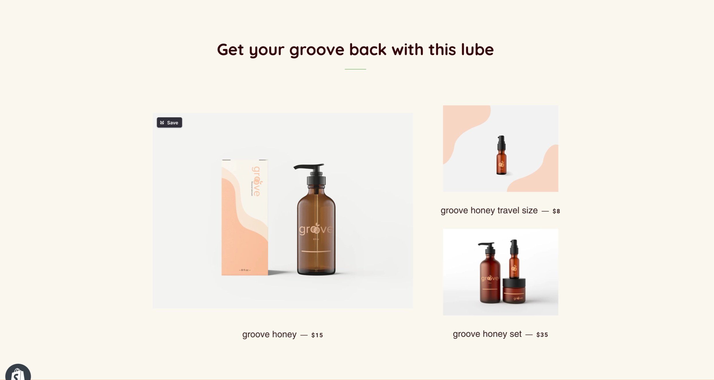
Below are a few screenshots of how I combined the logo, products, and brand on the Shopify site. To view the full site, please contact me, and I can send you the login information.


